Form Design - Form Properties
The Properties tab allows you to configure the properties of the currently-selected object. If you do not have an object selected, the Properties tab displays properties that pertain to the entire form.
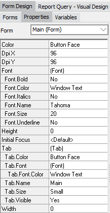
- Color - Specifies the background color of the form.
- Dpi X/Y - The DPI that the form was last edited at. This value sets itself automatically and should not typically need to be modified.
- Font - Allows you to set various font properties, such as the font to use, its color and size, and bold, italic, and underline. Changing the font here changes it for the entire form, including for any existing form objects that do not have an explicit font set in their properties. For more information on object properties, including fonts, see Form Design - Object Properties.
- Height and Width - Specifies the maximum height and width of the form. When running the dashboard in the Argos client, these values control the dimensions that the dashboard window opens in. The height and width settings have no effect in the Web Viewer, where dashboards always open full screen in the browser. If you have specified both a height and a width, you will see a pair of dotted lines in the form design window to let you know how much room you have to work with when developing the form.
- Initial Focus - Specifies the object that should receive focus when the form loads. If not set, the first item in the focus order defaults to the most upper-left object on the form. Only dashboard objects that can receive focus (buttons, dropdowns, date and edit fields, list and memo boxes, radio buttons, and checkboxes) are available to set as the Initial Focus object.
- Tab - The Tab property allows you to create a DataBlock consisting of a number of forms with each form displayed as a tab. Tabs may be edited to the user's desired specifications using the tab sub-properties. These controls include tab name, color, size, font, font color, and whether tabs should be visible when launching a dashboard with multiple forms.
For example, in the figure below a DataBlock was created with three forms, each on its own tab. The Employees tab contains a multi-column list box where the user selects one or more Employees. The Purchase_Order_List tab contains a form which lists Purchase Orders submitted by the selected Employees. The Purchase_Order Chart tab contains a form with a chart that displays Purchase Order summaries for the selected Employees.
This DataBlock is designed such that the user clicks the Employees tab, selects the desired Employee(s), then clicks on either the Purchase_Order_list or Purchase_Order_Chart tab to view the query results. Queries written for the forms within in the Purchase_Order_List and Purchase_Order_Chart forms obtain Purchase Order records for the Employee(s) selected on the Employees tab.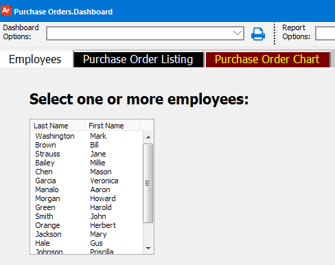
The figure below shows the Purchase_Order_List tab selected with the query results from the associated form.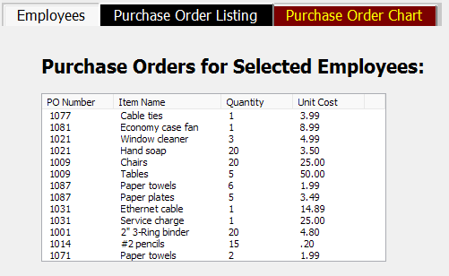
This DataBlock contains three forms, corresponding to the three tabs, Employees, Purchase Order List, and Purchase Order Chart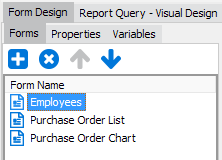
In the Properties tab for each form, note that the Is Tab property is set to Yes, resulting in the creation of the three tabs shown above.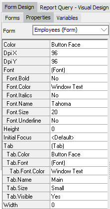
Note: The Tab.Name property determines the text label that is shown on the tab. By default this is the same as the name of the form, but you can edit it as needed.
For further reading, the Argos DataBlock Designer Guide contains an example of how to create multiple forms. This example uses buttons to navigate between forms, but you can also use the Is Tab property to let the users switch between the forms using tabs.